Ross Williams, co-founder of online dating service provider Global Personals
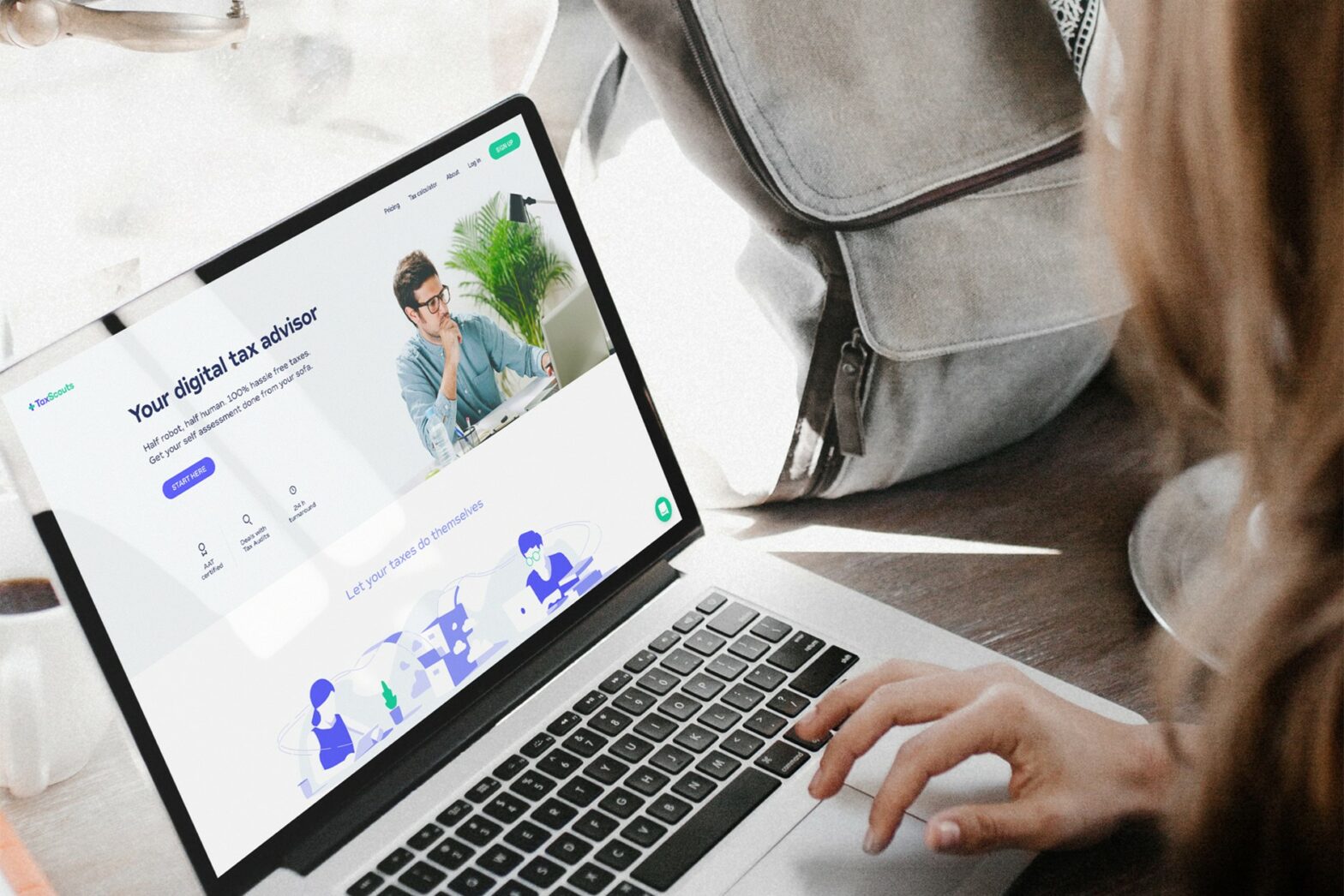
We run the dating services for brands like Cosmopolitan and FHM as well as for some specialist sites, such as FriendsOfYours, which is for older couples. For me, the most important thing has been to test the website. On Google Analytics you can see how people are using the site and you can use that to improve every part of it. Companies can waste tens of thousands on marketing, but if only 5 per cent of the people who visit your site are buying something, you should be looking at a redesign.
You don’t need to make your website different for the sake of it. Be unique with your brand, with your proposition, but be conventional when it comes to usability. And use your product yourself. Both my co-founder and I discovered the loves of our lives on one of our sites. Anyone who doesn’t use their own site is crazy, as it’s the best way of putting yourself in the position of the consumer.
Mark Rogowski, founder of online cake shop Plwmp
We wanted a clear, crisp site with close-up pictures of the products and not too much clutter, which we felt could be offputting to users. But we also wanted the website to be fun, so we chose lots of bright colours.
In terms of search engine optimisation (SEO), it’s really important to get the pages technically correct – that way the Google and Yahoo spiders will pick you up. We’ve spent a lot of time ensuring the right search terms are embedded in the main pages.
We use an online facility for payment, but also have an option that allows you to pay on delivery. We didn’t want to put anyone off who was concerned about online security.
Tabitha Potts, founder of eco store MimiMyne
As we are a green business, we wanted to get that message across in the website’s branding. Our apple motif was chosen as something that encapsulated our ethos, as well as being fun and for kids. We’ve also got lots of animation on the site and games people can play to make it interactive.
The site’s blog has been really useful. Having regular content is great for SEO, and it’s also a good way to stay in contact with people and to network.
There’s an option to pay with PayPal, WorldPay or just through customers typing their details in. Although PayPal does take a higher cut from us, it’s useful as it’s so convenient for customers.
Gavin Littlejohn, co-founder of personal finance management site Money Dashboard
Our website has gone through various designs to match each stage the company has been at. When we were looking for investors, it was geared towards that audience. Back then we included a lot of information on consumer feedback, market research and news updates about who had joined and the investment we had raised.
Now we are approaching the launch stage we’re making it more consumer-oriented. As people are concerned about security, we’ve emphasised our in-built fraud prevention software. We’ve made it as user-friendly as possible, emphasising that this is a free product. The timing could not have been sweeter for us as everyone is so concerned about managing their finances at the moment.


