

If you’re getting plenty of visitors to your website but not many sales, you’re not alone. Most websites convert visitors to customers at a very low rate, often less than 3 per cent. Here are seven tips to help.
If you’re getting plenty of visitors to your website but not many sales, you’re not alone.
Most websites convert visitors to customers at an alarmingly low rate, often less than 3 per cent. That doesn’t mean to say your product is wrong, or that you’re too expensive. Above all, it doesn’t mean it’s not worth having a website.
Revealingly, visitors decide whether to stay on a site or leave in just five seconds, which means it’s important to grab their attention, make it easy for them to stay, and help them to get in touch or decide to buy. Here are seven proven rules you can apply to your website to give it the best chance of passing the five-second test.
1. Don’t give them a choice
Most websites make competing demands on their users. They ask people to ‘click here’, ‘sign up to our newsletter’, ‘start shopping’, ‘book an appointment, or ‘buy now’.
When faced with a choice, some users would rather leave than make that choice. Others get distracted mid-purchase by an offer that catches their eye. So if you want your visitor to do something, funnel them towards that goal by removing any choices they have to make.
2. Let visitors buy from every page
Most websites showcase products on lots of different pages, including the homepage, a product page, and often a category page.
Don’t make your users navigate through several ‘more info’ buttons before they see a ‘buy now’ one. Each time they’re forced to click through, a few will make the decision to leave.
Give them the option to buy straight away, and every time the product is shown. If your visitor makes the decision to buy, they need to be able to do it straight away – before they change their mind.
3. Big buttons work…
Up to reasonable limits, the bigger the button, the more clicks it gets. So if you want lots of people to click ‘buy now’, then make sure the button is really big!
4. … and make them obvious
Not only do your ‘buy now’ buttons need to be big, they also need to be in an obvious place. ‘Buy now’ buttons are usually on the lower right hand side of the page, but here’s a few more rules you should follow. Put them right next to the product you’re selling, make sure they’re above the fold (the bottom of the screen for most browsers) and give them a bold colour that contrasts to the rest of the website. Include text such as ‘order now’, ‘buy now’ or ‘sign up’. If you’ve got a long page, repeat your button lower down in the same vertical line
5. Give every product its own page
Pages that have a single product are important for two reasons. To start with they provide the best environment to showcase the product away from the competing demands made by others. And second, single product pages give you the opportunity to rank highly on Google for search keywords that are specific to that product.
6.Sell, sell, sell!
A product on a website will not sell itself – that bit is up to you. Give your website visitors clear reasons why they should buy. Make sure that you have a bold headline, add some reasons to buy as bullet points, use a good product image and include customer testimonials. The page needs to look and feel uncluttered. Above all, avoid blocks of text – rather than spend time reading and learning, your visitors will go elsewhere for a simpler experience. Anywhere you’re listing more than one product, your visitors have to choose which one is best for them. Help them decide with a simple graphic that highlights one choice above the others. The message might be ‘most popular’ or ‘biggest discount’.
7.Test out your design changes
The chances are, you’ve spent so much time looking at your website that you can no longer see the wood for the trees. Try getting feedback on your new design by asking a newcomer to buy, and watch them move through the site, or post a link on a small business forum and ask for feedback. Don’t forget to check your analytics package to see if your bounce rate has fallen and the average time spent on the site has gone up. If these tests fail then it’s time to try a further change.
That’s all
These simple changes can help turn more of your website visitors into browsers. Be clear, be bold, use plenty of space, minimise clutter and remove choice. Make it easy for your visitors to buy from you.
The WebEden free website builder allows you to get a website up and running quickly. You can sell products, upload videos and integrate your blog. Click here to find out more.
Related Stories
PR and Marketing Strategy
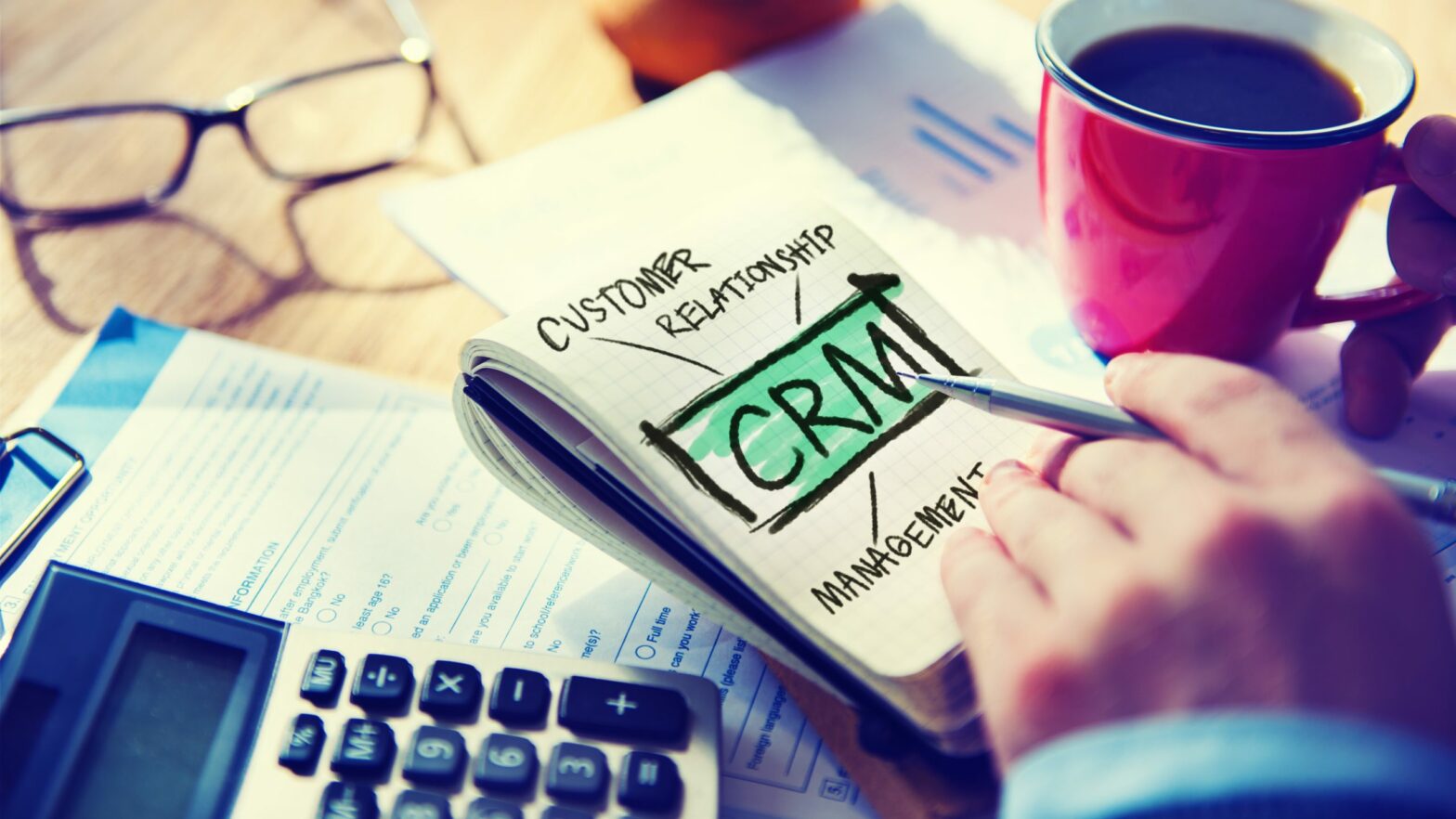
What is CRM and what does it do? Growth Business guide to CRM
PR and Marketing Strategy
Should influencer marketing be part of your game plan?

Growth Planning
Scaling your start-up? The answer is in the data

Partner content