The team at Morgan Pryce have collected together their favourite offices in London, giving their reasons why they made the cut. Here are the top 10, with hardly a fluorescent light or polystyrene cup to be seen.
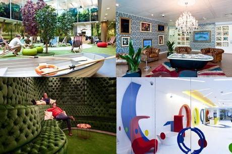
Not a surprising entry, given the brand and the big bucks behind it, but definitely a deserving one. The company’s office is divided into quirky spaces, with rooms such as the ‘Velourmptious Snug’, a take on the British pub, and ‘Granny’s Flat’, with old-fashioned chairs, patterned rugs and fringed lampshades that begs you to sit down with a cup of tea and a biscuit.
There is a library with a great horse-shoe shaped padded bench, covered in cushions, and plenty of other areas that celebrate the art of soft furnishings and surface pattern. Jo Robinson, senior consultant at Morgan Pryce, has been lucky enough to experience the Google offices first hand, and declares, ‘the canteen is amazing’. Perhaps they’ll be hiring it out for weddings next!
88 Wood Street
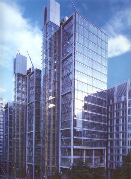
Not wishing to favour design over technology, what is impressive about this building is the lift. What gets people talking? Make sure you take a pound coin with you – no, you don’t have to pay for the use of the lift. Instead, place the coin on its side on the hand rail as you ride: watch it balance while you ascend the 18 floors of this City of London skyscraper. Rhodri Mason, surveyor at Morgan Pryce, backs this up and says, ‘You can’t feel that you’re moving when you’re in this lift – it’s almost science fiction.’
Mind Candy

While the name of this company might not ring any bells – the brands it creates certainly do. Think Moshi Monsters (if you have kids under 10). The company claims, ‘Creating magical entertainment on mobile and tablet is what we do’, and the creativity that has bumped this start-up up the brand ladder has also crossed over into its office design.
Eugene O’Sullivan understands how the concept behind the office works well and adds, ‘You can’t create fun if you don’t have fun – the office represents the brand.’ This office, branded one of the ‘coolest’ by the Telegraph, has soft toys, designer displays, colouring-in walls, Moshi Monster murals and – best of all by far – slides from one floor down to the next.
1 Plantation Place

Somewhat space age on the outside and the inside, the developer of this building, Broadgate Estates, has twice won awards in London’s Clean City Awards Scheme, with the result that 1 Plantation Place is a clean and bright place for the financial and insurance occupant workers to spend their day.
In a brave move not to use every square foot of space for offices, the reception lies within a huge, bright space. Director at Morgan Pryce, Fraser Williams, is particularly fond of the ‘triple-height reception’, which encourages the visitor to look up and around them as they enter. Plenty of glass and a use of lighting that wouldn’t be out of place in a high-end apartment; this building leaves the rest out in the dark.
The Unilever building
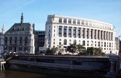
‘Better out than in’ is not an expression that can be applied to this building. Stunning period design on the outside belies the modern interior, giving workers here the best of both office worlds.
The Blackfriars Grade II listed building stands grandly over the River Thames, rewarding its workers with an unrivalled view from their desks. Desks that happen to be surrounded by walkways, designer chairs, glass and steel fixtures, with pops of colour injected into the design scheme, as well as ergonomic furniture, and proper lighting, with lampshades.
41 Lothbury Street

This building, now used for serviced offices, is one to impress. Incorporating all that is great about old London architecture, when time and money were invested into design and decoration, it welcomes visitors with an engraved stone façade and elegant windows, and yet what is inside takes your breath away further.
Giant columns stretch high into the double-level interior, with cornicing and intricate stonework above you and the original marble floor beneath your feet. Alex Goode’s experience led him to say, ‘If you arrive here not expecting this great, 1920s building, it might be some time before you stop looking around you and remember what you came for.’
25 Gresham Street
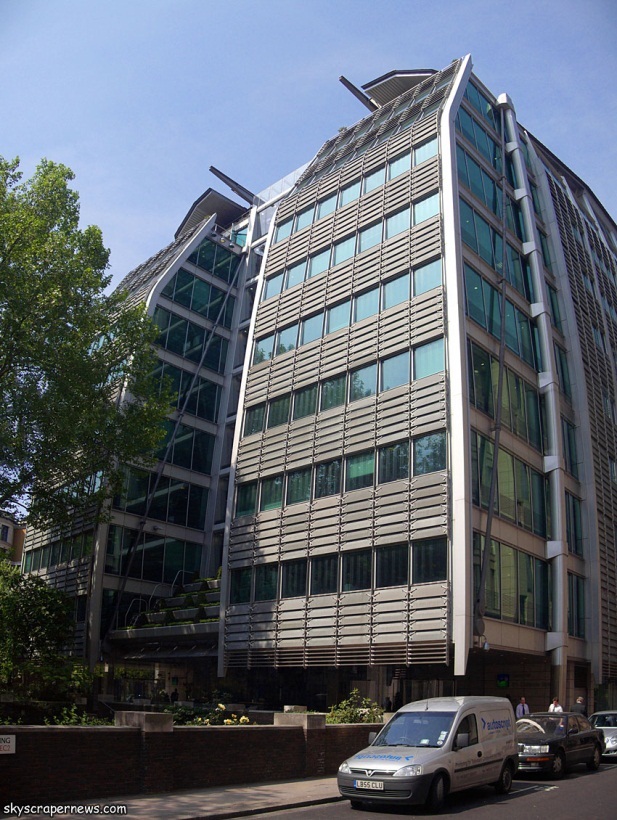
This Lloyds Bank building was constructed in 2002 on the site of an old 1950s building. The result is a 10-storey, column-free graceful building that was consciously designed to take into account the adjacent churchyard and its trees. The building’s two protruding bays overlook the site, while inside, natural materials such as slate and stone have been incorporated.
10 Gresham Street
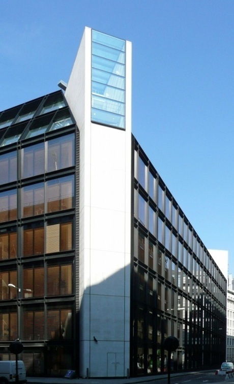
It stands out, literally and figuratively. Surrounded by more traditional London properties, number 10 has been built so that you take a second look. Its atrium boasts an undulating glass wall that is reminiscent of being underwater while its white outer steps mirror the curves of the wall – a contrast to the stark and sharp angles that make this building stand out at roof level. Two periscope-like rectangle windows stare out from white facades at both ends of the building, as though keeping watch over the rest of the street.
The Gherkin
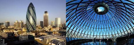
It had to be on the list, not least because it was the first of London’s skyscrapers to earn a nickname. Completed in 2003, in the City of London, we don’t really need to tell you what it looks like – from the outside.
On the inside, there are shafts of light created by the glass and shape of the building, so that natural light is used more than artificial. The space proved flexible, despite the unusual space, and the largest law firm occupier was even able to install its own staircase to access its four floors. Tenants have even reported gaining business, just because people want to visit the building.
Heron Tower
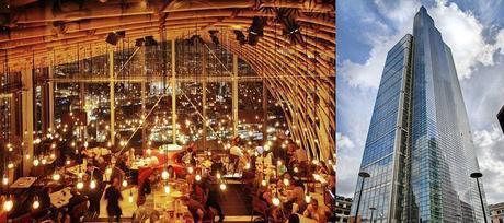
We won’t lie: we like this one because of the restaurant. And the Sky Bar. At 175 metres high, there’s a buzz that can only be felt by looking down on London. Day or night, the views are stunning, and you’re sure to be distracted from your meal or drinks by looking out on the scene below.
Sally Brough notes that it’s fast becoming one of London’s most popular eateries and says, ‘Sitting on the outside terrace so high up is one of London’s best experiences.’ We can only imagine how tempting it is for the office workers in the Heron to slip up here, whether for work or play – although they won’t be complaining at their own views.
Claiming on its website to be ‘an innovation in office design’, the Heron provides what it calls a ‘village’ concept, comprising a base floor and two gallery floors and boasts maximised natural light and renewable energy supplies. And a great place to have your lunch.


