
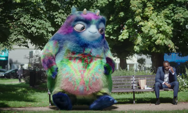
Poor Workie. The seemingly loveable character has come up against something of a hostile reception this week. He (it has a male voice so we’ll go with he) is the brainchild of the Department of Work and Pensions (DWP) and a PR and branding company who would probably rather remain anonymous at this point.
His purpose is to act as a physical embodiment of workplace pensions. The idea is to engage small businesses and their employees – reminding the firms of their auto-enrolment duties and ensuring staff get a fair deal.
The only problem is the message is getting lost due to widespread mockery of Workie himself and his bizarre appearance. Oh, and it’s since come out the whole sorry affair has cost the taxpayer £8.5m.
In honour (of sorts) of Workie we’ve compiled five marketing and branding exercises that have been equally, or in many cases more, disastrous. Some salutary tales here…
British Airways’ alternative tailfins – £60m
Back in 1997 British Airways decided their planes needed a bit of a revamp. After a period of consultation they decided that they would replace the traditional tailfin livery of the Union Jack with designs inspired by cultures around the world.
>See also: Harnessing big data to market to Millennials
It sounds like a good plan in theory and who wouldn’t want to introduce some diverse cultural imagery to their brand? At the time BA boss Bob Ayling said: “Perhaps we need to lose some of our old-fashioned Britishness and take on board some of the new British traits.”
But the £60m project soon ran into some pretty high-profile disapproval. Former prime minister Margaret Thatcher famously covered a model of the ethnic livery with a handkerchief from her handbag, declaring: “We fly the British flag, not these awful things”.
Things never really improved and in 2001 the decision was taken to restore the Union Jack to the whole fleet – no doubt to much further expense.
Pizza Hut rebranding as Pasta Hut – £100m
Back in 2008 someone in the higher echelons of Pizza Hut’s marketing department decided that they needed to present a healthier face to the public. After some meetings we can only assume were very uninspired they arrived at the idea to rebrand as Pasta Hut.
Sadly for them everyone remembered that when they are thinking of their health Pizza Hut is the furthest brand from their minds. After rebranding a number of stores and making some big announcements, everything suddenly went very quiet and Pizza Hut were left trying to pretend it had never happened. At £100m that’s a bowl of pasta even the Pope might struggle to afford.
Cardiff City – £100m
In 2012 controversial Cardiff City owner Vincent Tan decided he needed to do something to capitalise on the famous patriotism of the Welsh. So he commissioned the design of a completely new club logo that was essentially a poor man’s version of the Welsh flag – it even had the exact same dragon.
One slight stumbling block came in the colour of the badge and subsequently the team’s jerseys. Cardiff City have since time memorial been known as the Bluebirds – largely due to the fact they play in blue. But Tan and his team decided that to get the Welsh fans on board they had to play in red, the same colours as the national team.
In exchange for the fans’ patience Tan was forced to make a series of pledges, one of which was to deliver Premiership football to the city. He did achieve this is 2013/14 but sadly it was short lived and the club is currently back in the second tier. Despite fierce pressure to change back, the team still play in red. No one believes the decision has reaped any financial benefits though.
Wenlock and Mandeville – Undisclosed
Despite a large dose of British pessimism in the build-up, the 2012 London Olympics were a roaring success. Infrastructure, sporting excellence and a wave of overwhelming goodwill combined to make it an occasion to make every UK citizen swell with pride.
>Related: Put your money where your (word of) mouth is
However, mascots Wenlock and Mandeville will go down in history as less than a triumph. A bizarre dog’s dinner of a design that was supposedly intended to engage with the digital generation and inspire children with their undercooked back story, they never really took off and played an increasingly low-key part in proceedings as the games went on.
But worse was to come for Hornby, the toy manufacturer who secured the deal to produce the affiliated Wenlock and Mandeville merchandise. The souvenir toy versions were so unpopular the company’s share price plummeted by a third and it was forced to issue a profit warning. At the time of writing Wenlock and Mandeville were unavailable for comment.
BP’s new eco-friendly logo – $211m
In 2000 oil company BP decided they’d had enough of being smeared as being bad for the environment. So they revealed a new logo that was inspired by Helios; the Greek God of the sun.
The intention was to highlight BP’s position as a global leader in clean energy and not money-thirsty oil barons. Sadly they decided against actually following that up with any sort of ecological strategy. Things got worse for the company (and frankly everyone) in 2010 when the company was involved in one of the worst ecological disasters of all time.
The Deepwater Horizon spill put pay to any thoughts of BP being an eco-warrior’s best friend. It also, sadly for the company, revealed that the logo itself was quite easily manipulated to resemble an oil spill.
Further reading: Fuelling business growth through marketing
Related Stories

Legislation and Regulation
How to handle Data (Use and Access) Act rules

PR and Marketing Strategy
Are trade shows still worth the investment for B2B brands?
PR and Marketing Strategy
What is CRM and what does it do? Growth Business guide to CRM
PR and Marketing Strategy